5 Low Effort SaaS Conversion Strategies - Part 1
Learn how concise landing pages, exploratory headlines, and time-limited discounts can drive higher engagement and conversions for SaaS Websites.
Last week, while scrolling through my notes, I came across a list of growth tactics for SaaS companies that I’ve implemented across my startups.
When I say growth tactics, it’s a broad term. Narrowing it down to specifics, these are typically tips to improve conversions from…
“Acquisition to Activation” and “Activation to Retention.”
I made a list of more than 50 tactics in 2022, and they’re still applicable today. I decided to dig deep into five of those and publish them as a newsletter.
If you like it, please comment and reshare. I’ll then share more in upcoming newsletter issues.
Here, I’m going to cover five tips for SaaS businesses to improve conversion rates.
→ Tip 1: Keep It Concise – Less Is More on Landing Pages
An industry benchmark report from Unbounce revealed that landing pages with fewer words tend to have the highest conversion rates for Customer Acquisition.
→ Tip 2: Opt for Exploratory Headlines Over Commitment-Taking Phrases
Encourage engagement by shifting from commitment-heavy headlines to more exploratory and inviting ones.
→ Tip 3: Remove “Free” to Enhance Perceived Value
In some cases, eliminating the word “free” from your CTAs can actually increase conversions by avoiding negative associations.
→ Tip 4: Use Time-Limited Discounts to Create Urgency
Boost funnel conversions by sending time-sensitive offers to your email list.
→ Tip 5: Focus on Value with Your CTAs
Replace traditional "Call to Action" buttons with "Call to Value" messaging to emphasize the benefits your prospects / users will receive.
Tip 1 (Conversion Optimization) : Keep It Concise – Less Is More on SaaS Websites
Ever get curious, why do some SaaS pages just work? It is actually simpler than you think:
fewer words
An industry benchmark report from Unbounce revealed something fascinating— pages with fewer words tend to convert the highest. How few?
The best converting pages had under 200 words!
Here’s the thing:
In a world overloaded with information, people’s attention spans are shorter than ever. They’re skimming, not reading. So, the faster you can get your message across, the better is the user experience.
Attention Span: The average visitor decides whether to stay or bounce within seconds. Concise copy helps capture attention quickly.
Clarity: Fewer words force you to be clear and direct. No room for fluff—just the essentials.
Decision-Making: When your message is concise, it’s easier for visitors to understand the value and take action.
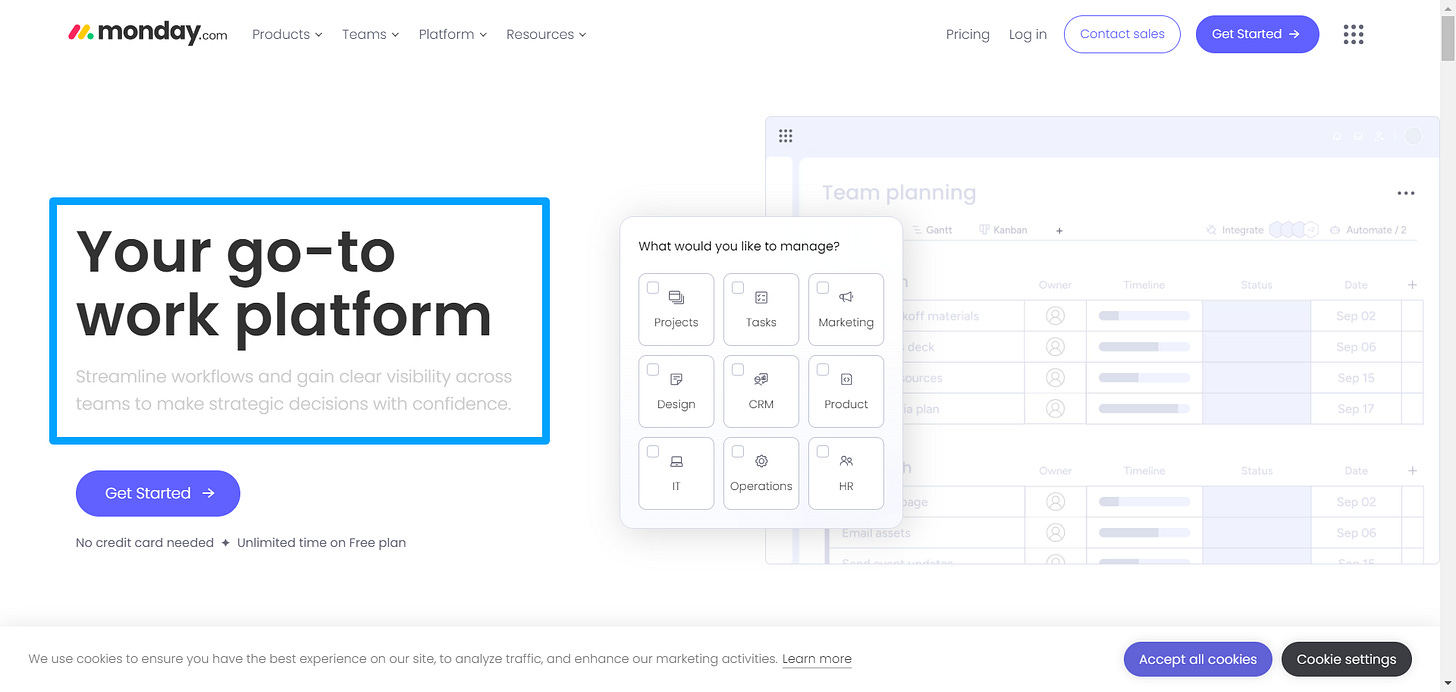
Example 1. Monday.com
Take a look at Monday.com's home page. You can practically count the words on that page with your fingers (okay, not really, but it’s close). The page is laser-focused, and it works. Here’s why:
Clear Value Proposition: Right from the start, Monday.com tells you what they offer and why it matters.
Minimalist Design: The clean layout with minimal text ensures nothing distracts from the core message.
Strong CTA: The call-to-action is front and center, making it easy for visitors to know what to do next.
Example 2. Trello
Trello’s home page is another excellent example. They keep their copy tight, focusing on the core benefits of their product—organizing tasks effortlessly. Here’s how:
Simple Messaging: Trello uses concise, straightforward language to explain how their tool can help you stay organized.
Visual Appeal: The page uses visuals to do much of the talking, with short captions to guide users through the features.
Immediate CTA: The "Sign Up - It's Free" button is prominently displayed, encouraging users to take action right away.
Example 3. Slack
Slack’s home page is a masterclass in brevity and clarity. They communicate their value with just a few impactful words. Here’s what they do right:
Direct Headlines: “Make work life simpler, more pleasant, and more productive.” That’s it—short and sweet.
Visual Storytelling: Slack uses images and minimal text to show how their product improves communication.
Engaging CTA: The call-to-action is clear and stands out, prompting users to "Get Started" with ease.
How to implement for Conversion Rate Optimization?
Identify the Core Message: What’s the one thing you want visitors to remember? Lead with that.
Cut the Fluff: Go through your copy and ask yourself, “Is this sentence essential?” If not, cut it out.
Focus on Benefits: Visitors care about how your product will help them. Make sure your copy reflects this.
Use Bullet Points: They’re easier to scan, especially on mobile.
Test and Iterate: Start with a shorter version of your home page and see how it performs. Adjust based on the data.
The Impact: High Returns with Minimal Effort
Here’s the best part: This strategy requires little to no effort and zero budget. But the impact? Potentially massive.
Estimated Effort: Minimal
Anticipated Impact: Very High
Page Type: Home Page
Requires Budget: No
So, give it a try. Sometimes, less really is more to prevent churn.
Tip 2 (Conversion Strategy) : Opt for Exploratory Headlines Over Commitment-Taking Phrases
Let’s talk about a small tweak that can lead to big results: shifting your “Headline and CTA” from commitment-taking to exploratory.
Google increased form engagement by 17% just by changing the headline from…
"Book a room" to "Check availability."
That’s a significant boost for such a minor change.
Why the Shift Works?
Think about it—"Book a room" feels like a big step. It’s a commitment. You’re telling the user, “Hey, you’re about to lock yourself into something.” That’s a hard ask, especially when people are just browsing or trying to figure out if your product is right for them.
Now, compare that to "Check availability." This phrasing is inviting. It doesn’t pressure the user. Instead, it says, “Hey, take a look around. No strings attached.” The user feels in control and more comfortable moving forward.
This simple change can lower the perceived risk and make the user more likely to engage.
Applying this to your SaaS Website
You can easily implement this strategy on your home pages, and during onboarding. Here’s how:
Identify Commitment Points: Start by pinpointing where your current headlines might feel too demanding. Look for phrases like "Sign up now," "Create an account," or "Start your free trial."
Rephrase for Exploration: Shift these headlines to something more exploratory. For example:
"Create an account" could become "Give it a try."
"Start your free trial" could become "Explore your free trial."
"Buy now" could become "Discover pricing options."
Process: How to implement the change for CRO
Audit Your Current Pages: Go through your landing pages, home page, and any other key touchpoints. Identify the headlines and CTAs that might feel too pushy.
Brainstorm Alternatives: For each commitment-taking headline, brainstorm more exploratory alternatives. Think about how you can make the action feel less like a commitment and more like an invitation to explore.
A/B Test Your New Headlines: Don’t just assume the new headlines will work better—test them. Run A/B tests to see if the more exploratory language increases engagement.
Analyze the Results: After running your tests, analyze the results. Look for improvements in metrics like form submissions, sign-ups, and overall engagement.
Iterate and Optimize: Use the data from your tests to refine your headlines further. Continue to experiment and find the perfect balance between inviting and actionable.
Impact: High Gains with Medium Effort
This shift doesn’t require a huge overhaul of your website, but it does require thoughtful consideration and testing.
Estimated Effort: Medium
Anticipated Impact: High
Pages: Landing Pages, Home Pages, and Key Conversion Points
Requires Budget: No
By shifting from commitment-taking headlines to more exploratory ones, your audience feels less pressured and more inclined to engage with your product.
Give it a try, and see how this simple change can lead to significant growth in your conversions.
Tip 3 (Optimize): Remove “Free” to Enhance Perceived Value - Specially for B2B SaaS
Try Removing the Word “Free”
Here’s a surprising insight: sometimes, using the word “free” can hurt your conversions.
It sounds counterintuitive, right? After all, who doesn’t like free stuff?
But in some A/B tests, call-to-action (CTA) buttons with the word “free” actually decreased conversions.
Why? It’s likely because “free” can sometimes carry a negative connotation—people might perceive it as being less valuable or too good to be true, typically in case of user/business sensitive data and operations
Why “Free” Isn’t Always the Magic Word for SaaS Conversions
We often assume that offering something for free is the best way to attract users. But here’s the catch: when people see the word “free,” they might start questioning the value of what’s being offered.
Perception of Value: “Free” can sometimes make users think that the product or service isn’t worth paying for. If it’s free, how good can it be?
Skepticism: People are increasingly wary of hidden costs or strings attached. The word “free” might raise red flags, making them hesitant to engage.
Psychological Triggers: Words like “free” can also trigger thoughts of spam or low-quality offerings, which might lead to a drop in trust and, ultimately, conversions.
Example 1. Canva
Canva used to promote their “Free Plan” heavily. Now, their CTAs focus more on the benefits, like “Start Designing” or “Get Started,” which invite users to jump right into the experience without the baggage that “free” might carry.
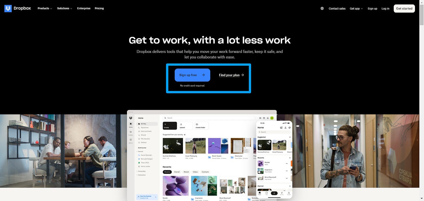
Example 2. Dropbox
Dropbox also made a similar shift by moving away from “Get Free Storage” to “Signup Free” or “Find Your Plan,” focusing on the value of their service rather than the cost.
How to Test This on Your Own SaaS Product
Identify Key CTAs: Look for the CTAs across your site where you use the word “free.” This could be on your home page, pricing page, or during onboarding.
Brainstorm Alternatives: Instead of “Start Free Trial,” consider alternatives like:
“Experience Premium”
“Try It Now”
“Explore Features”A/B Test Your CTAs: Run A/B tests with your new CTA options against the existing ones. Monitor key metrics like click-through rates, sign-ups, and overall conversions.
Analyze the Results: Dig into the data. Did removing “free” positively impact conversions? Did it lead to higher engagement or sign-up rates?
Iterate Based on Data: If the test shows positive results, consider rolling out the change more broadly across your site. If not, tweak the messaging and test again.
Impact: Optimize and Test your Pages
While this strategy might not be the first thing you try, it’s definitely worth considering once you’ve tackled other conversion optimization tactics.
Estimated Effort: Medium
Anticipated Impact: Varies, but can be significant if “free” is perceived negatively… Typically in case of user/business sensitive data and operations
Test across various page types like Home Pages, Pricing Pages, and Onboarding Screens.
Requires Budget: No
Removing the word “free” might seem like a small change, but it can have a significant impact on how your product is perceived. It also depends upon your offering… In some cases, “Free” has done wonders too.
By focusing on the value of your offer rather than the cost (or lack thereof), you might find that users are more willing to engage and convert.
Tip 4 (Conversion rates) : Use Time-Limited Discounts to Create Urgency for Conversions
If you’ve already built an audience, one of the most effective strategies to boost conversions is to introduce a time-limited discount. This tactic creates a sense of urgency, pushing your potential customers to act quickly before they miss out on a great deal.
Why Time-Limited Discounts Work for Conversions?
There’s a psychological principle at play here—FOMO (Fear of Missing Out). When people know that a special offer is available for a limited time, they’re more likely to take action immediately. No one likes to feel like they’re missing out on a good deal.
Urgency: A time limit naturally compels action. Customers feel pressured (in a good way) to grab the offer before it’s too late.
Scarcity: Limiting the number of available discounts adds an extra layer of urgency. When something is rare, it becomes more desirable.
Clear Call to Action: A time-limited discount simplifies the decision-making process. It’s now or never, so there’s no room for hesitation.
Example 1. Evernote
Evernote often uses time-limited discounts to entice new users to upgrade to their Premium plan. For example, they might send an email with an offer like, “Upgrade to Evernote Premium at 40% off—offer ends in 48 hours!” This approach plays directly into urgency, driving quick decisions.
Example 2. Skillshare
Skillshare frequently runs limited-time promotions, such as “Get 2 months of Skillshare Premium for free—offer ends soon.” This creates a compelling reason for users to sign up now rather than putting it off.
Example 3. Hootsuite
Hootsuite has used time-limited discounts like “Save 30% on all plans—this week only!” to encourage users to upgrade or renew their subscriptions quickly.
Next Steps - How to Implement a Time-Limited Discount Strategy
Segment Your Email List: Start by identifying which segments of your audience are most likely to respond to a time-limited discount. This could be users who’ve signed up for a free trial but haven’t upgraded, or those who haven’t engaged with your product in a while.
Craft a Compelling Offer: The discount needs to be significant enough to grab attention.
Consider using offers like:
“Use code EARLY for 30% off—valid until Monday at midnight.”
“Only 100 spots at this price—grab yours now!”Set a Clear Deadline: Make sure the time limit is clearly communicated. Use countdown timers in your emails or pages to visually emphasize the urgency.
Send the Email: Roll out your time-limited offer via email. Keep the email concise, with a clear headline, strong call to action, and all the details about the offer upfront.
Monitor Engagement and Conversions: Track how your audience responds to the offer. Look at open rates, click-through rates, and most importantly, conversion rates. This will help you refine future campaigns.
Follow Up: Consider sending a reminder email as the deadline approaches. Something like, “Only a few hours left to save 30%—don’t miss out!” can spur last-minute conversions.
Impact: High Returns with Strategic Execution
Implementing a time-limited discount isn’t just about offering a lower price—it’s about creating a moment where your audience feels compelled to act quickly.
Estimated Effort: High
Anticipated Impact: Very High
Pages: Use in Email Campaigns or any Pages
Requires Budget: No
By strategically using time-limited discounts, you can tap into your audience’s sense of urgency and scarcity, driving significant boosts in conversions. This tactic is especially powerful when paired with well-crafted messaging and a clear, compelling offer.
Tip 5 (SaaS Conversion) : Focus on Call-to-Value rather than Call-to-Action
When it comes to SaaS conversion strategies, the words you use on your buttons matter more than you might think. The concept of a “Call to Action” (CTA) has been around forever, but there’s a more effective approach you might want to consider: Call to Value.
This strategy shifts the focus from what the user needs to do, to what they’re going to get. It’s a subtle yet powerful change that can significantly boost your conversion rates.
Why "Call to Value" Works
Let’s break this down. A traditional “Call to Action” button tells users what action to take—“Sign Up,” “Subscribe,” “Download.” While these directives are clear, they don’t necessarily tap into the user’s desires or motivations.
On the other hand, a “Call to Value” button emphasizes the benefits that the user will receive by taking that action. It creates anticipation and answers the all-important question: “What’s in it for me?”
Benefit-Oriented: Instead of telling the user to “Sign Up,” you’re telling them what they’ll gain by signing up, such as “Get Expert Tips.”
Motivational: This approach speaks directly to the user’s goals or pain points, making them more likely to engage.
Differentiation: With so many generic CTAs out there, a well-crafted Call to Value can make your product stand out from the competition.
How to Implement "Call to Value" on your SaaS Pages
Identify the Key Benefits: Start by understanding what your users truly want. Is it to increase productivity? Save time? Gain insights? Identify these core benefits first.
Reframe Your CTAs: Look at your existing CTAs and think about how you can rephrase them to focus on value.
For example:
“Stay Updated” becomes “Get Growth Insights.”
“Subscribe for Job Notifications” becomes “Get a Job.”
“Unlock the Database” becomes “Boost My Conversion Rate.”Test Different Variations: Don’t just settle on one version. A/B test different Calls to Value to see which resonates best with your audience. Pay attention to which benefits drive the most engagement.
Analyze the Impact: Once you’ve tested your new CTAs, analyze the results. Look at conversion rates, click-through rates, and overall user engagement to determine the effectiveness of your Calls to Value.
Iterate and Optimize: Based on your findings, continue to refine your CTAs. The goal is to consistently communicate the most compelling value to your users.
Impact: High Potential with Focused Effort
Switching from a “Call to Action” to a “Call to Value” isn’t just about changing words—it’s about changing your approach to how you communicate with your users.
Estimated Effort: High
Anticipated Impact: Very High
Pages: Apply to key touchpoints like Home Pages, Signup Forms, and Pricing Pages
Requires Budget: No
By choosing “Call to Value” over “Call to Action,” you’re not just telling users what to do—you’re showing them why they should care. This subtle shift can make your product more appealing and drive higher engagement.
Loved this post?
Featured Posts
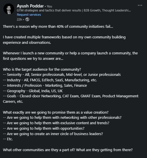
There is a reason why more than 40% of community initiatives fail…
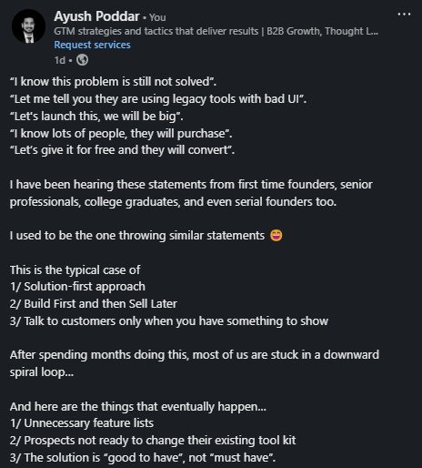
Validating Problem, not Solution
If you’re not a subscriber, here’s what you missed earlier:
Subscribe to get access to the latest marketing, strategy and go-to-market techniques . Follow me on Linkedin and Twitter.


